Clawhammer Supply
Turning a Functional Brewing Controller into a Product People Actually Loved Using
The Situation
The tablet worked. But it was built by engineers to validate hardware, not to serve users.
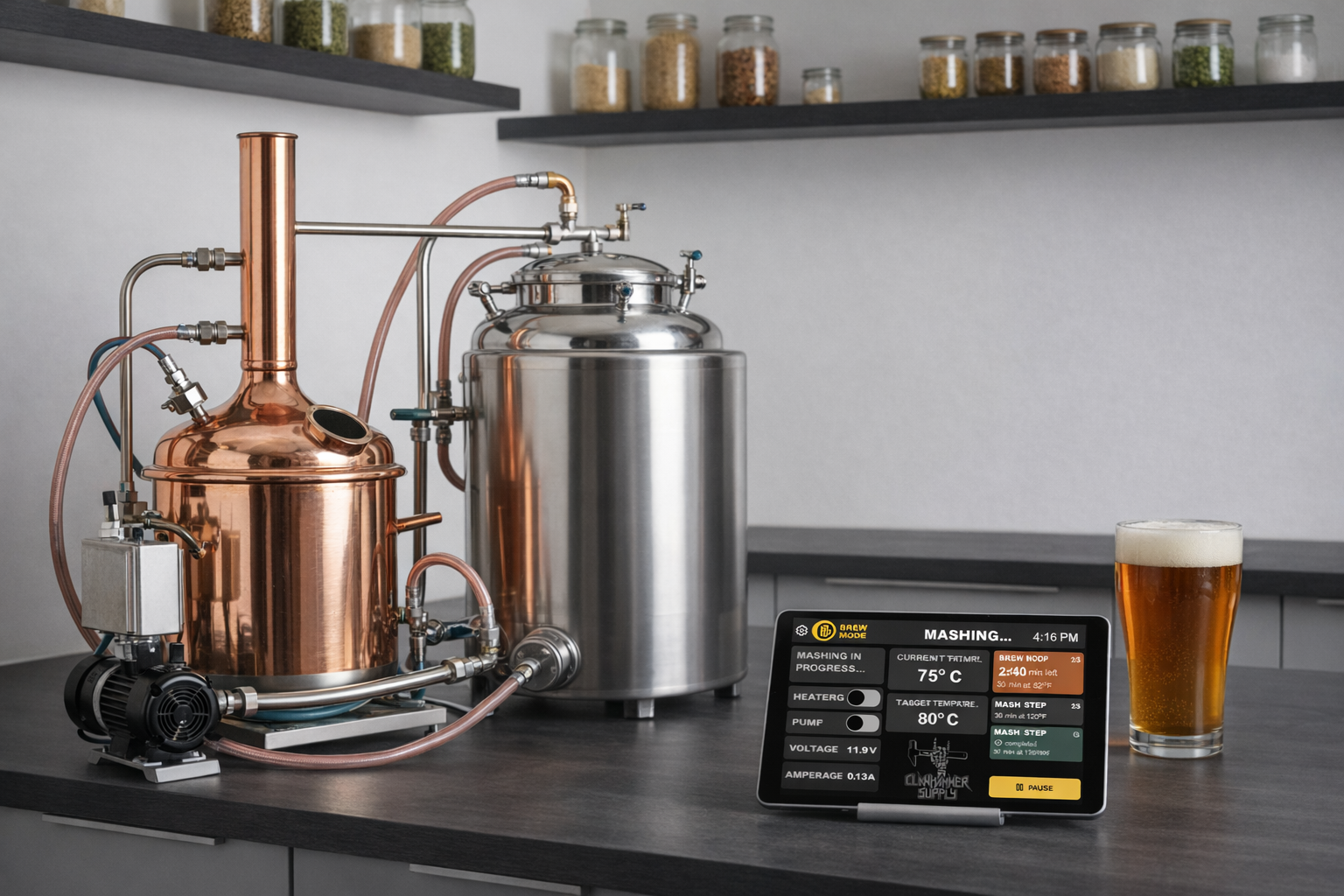
Clawhammer Supply sells premium home brewing equipment. To elevate the experience, they introduced a custom tablet controller that connected to their hardware system. Technically, it worked. But for a user base of 35–60-year-old hobbyist brewers, many non-tech-savvy, it created friction at every step. Brewing is physical, messy, and time-sensitive. The interface needed to guide, not just control.
Issue 01
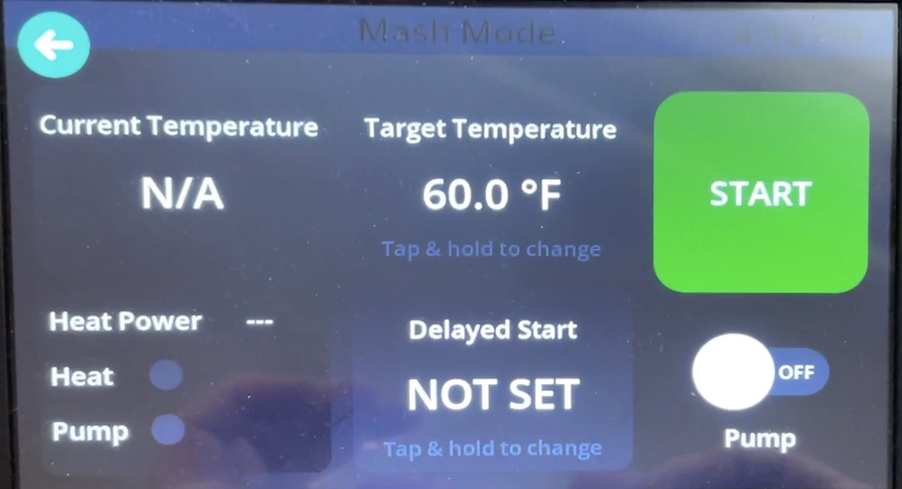
No onboarding to help users get started with the system.
Issue 02
No clear brewing guidance through the multi-step process.
Issue 03
No visibility into which stage users were in during a brew.
Issue 04
No scheduling or delayed start functionality.
Issue 05
Small touch targets on a tablet used with wet, busy hands.
Issue 06
Limited real-time feedback on system and brewing status.
The Real Problem
This wasn't a UI redesign. It was a clarity problem.
Users didn't know where they were in the brewing process, what to do next, whether the system was behaving correctly, if temperature overshoot was normal, or when to add ingredients.
Support calls confirmed it. Usability testing confirmed it. Observation confirmed it.
"The product wasn't broken. It was overwhelming."
The Strategy
From "manual hardware controller" to "guided brewing system"
I reframed the entire experience. Instead of a dashboard full of controls that users had to figure out, I designed a system that actively guided them through each stage of the brewing process. Then I rebuilt the flow accordingly.
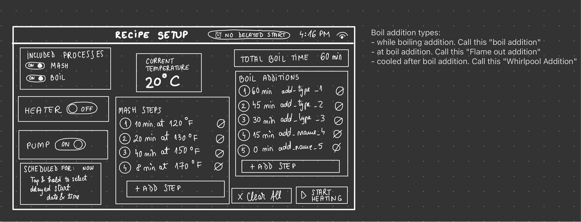
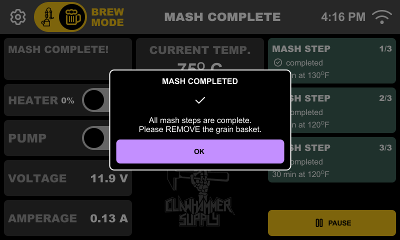
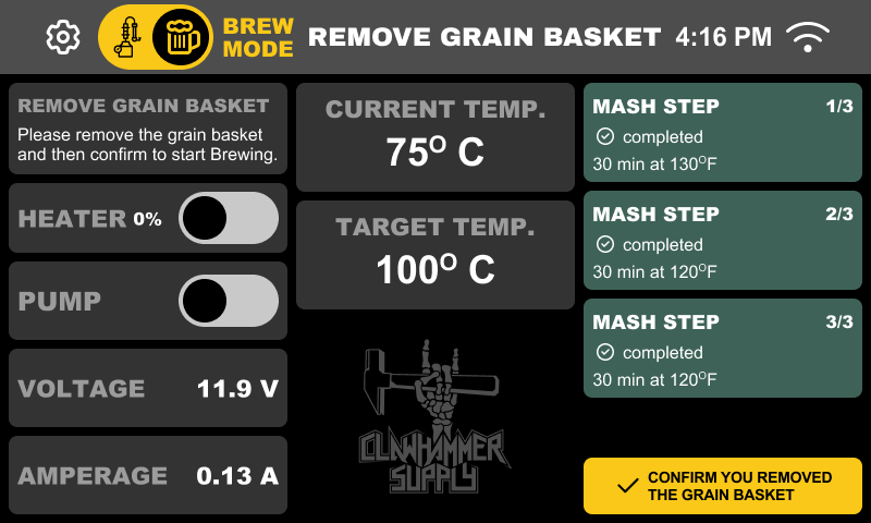
01 — Restructuring the Brewing Experience
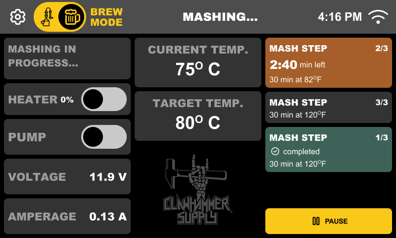
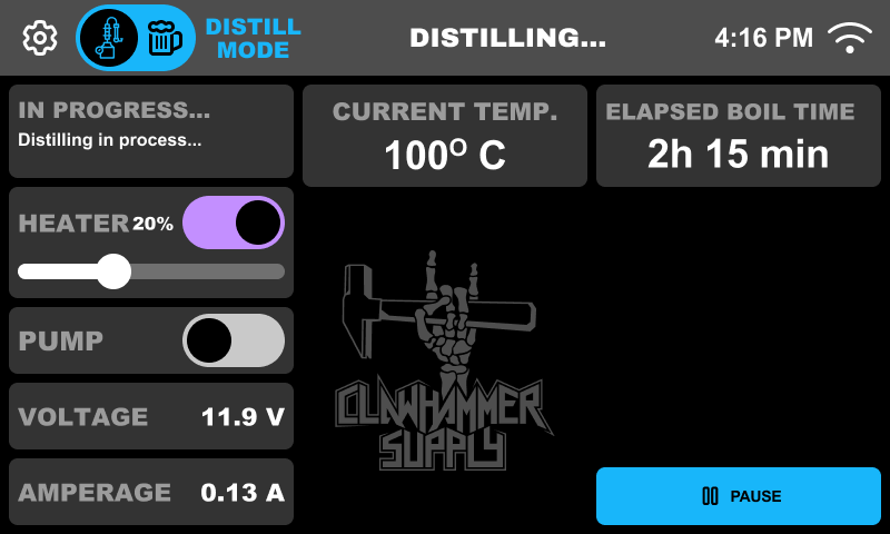
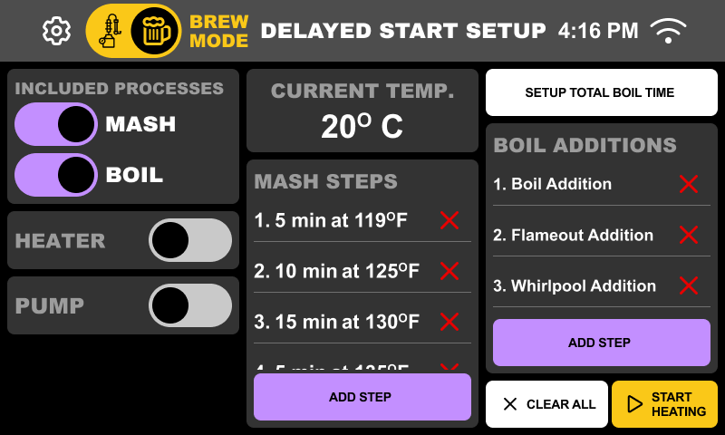
A guided, stage-based brewing flow
Instead of scattered controls, I created a structured experience where users always knew what stage they were in, what was happening, and what was expected next. Cognitive load dropped immediately.
- Guided, stage-based brewing flow
- Clear separation between Mash and Boil
- A dedicated distilling flow
- Live progress tracking
- Step confirmation before advancing
- Pause & resume functionality
02 — Making Setup Usable
Setup time dropped by 56%
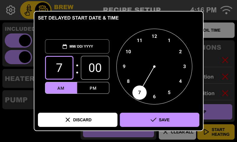
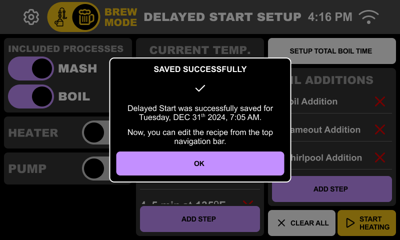
The MVP had no onboarding and no scheduling. I introduced contextual setup instructions, clear explanations for power settings, always-visible WiFi status, and a Delay Start feature that let users prep at night for an automatic start in the morning. This alone transformed how people used the system.
- Contextual setup instructions
- Clear power settings explanations
- Always-visible WiFi status
- Delay Start feature (prep at night, brew in the morning)
03 — Designing for Real Conditions
Usability under real physical conditions
The hardware introduced real constraints: a low-resolution screen, laggy scrolling, color inconsistencies, WiFi instability, a small display area, and older users with thick fingers. This wasn't about pixel perfection. It was about making things work in a brewery.
- Increased tap targets beyond standard guidelines
- Reduced gesture dependency for core actions
- Optimized contrast specifically for the tablet screen
- Tested everything on the actual device
- Ran internal A/B tests on button sizing
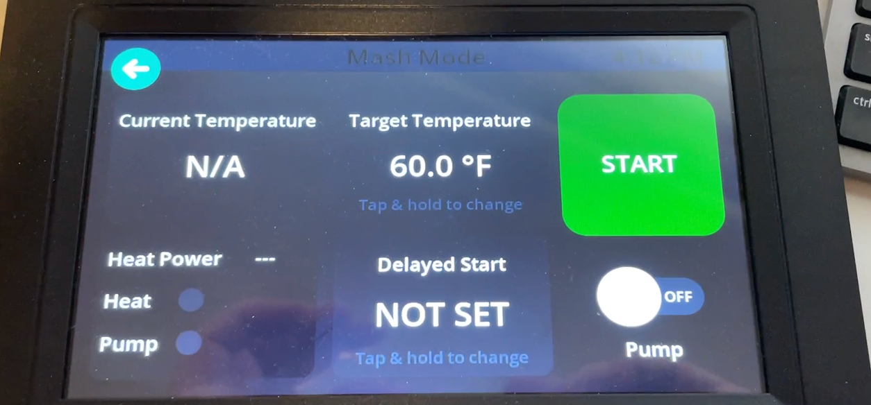
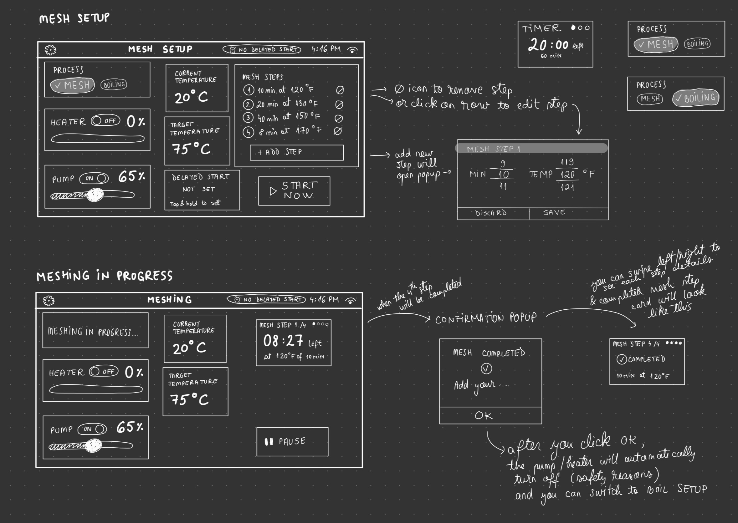
04 — Live Data = User Confidence
The product started communicating back
Brewing requires trust in the system. I added real-time feedback so users felt in control, not confused. The interface communicated system state clearly at every moment.
- Real-time temperature visibility
- Heater state indicators (warming vs overshooting)
- Clear pump controls
- Confirmed alarm interactions
- Step-based reminders
- "45 minutes remaining, add hops" notifications
Impact
Six months post-launch
The tablet shifted from a technical add-on to a value driver for the hardware. Previously inactive users returned, and confusion-driven support calls dropped significantly.
71%
Retention Increase
56%
Setup Time Reduction
↑
Returned Inactive Users
↓
Support Calls
What This Project Demonstrates
Skills & approach
- 0→1 product rebuilding
- Hardware + software integration
- Accessibility-driven decision making
- Flow restructuring for clarity
- Designing for non-tech-savvy users
- Sole ownership from concept to rollout
Thanks for reading! This project was a rewarding challenge. Turning a functional but overwhelming system into something people actually enjoyed using. That's all. 👋